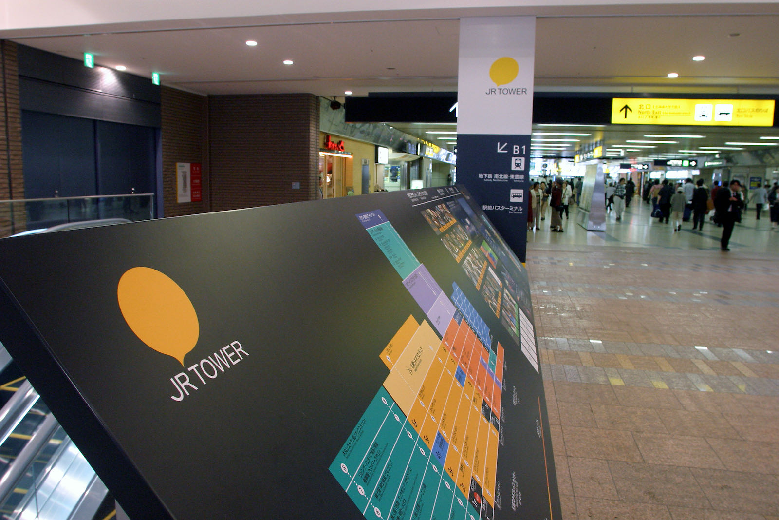
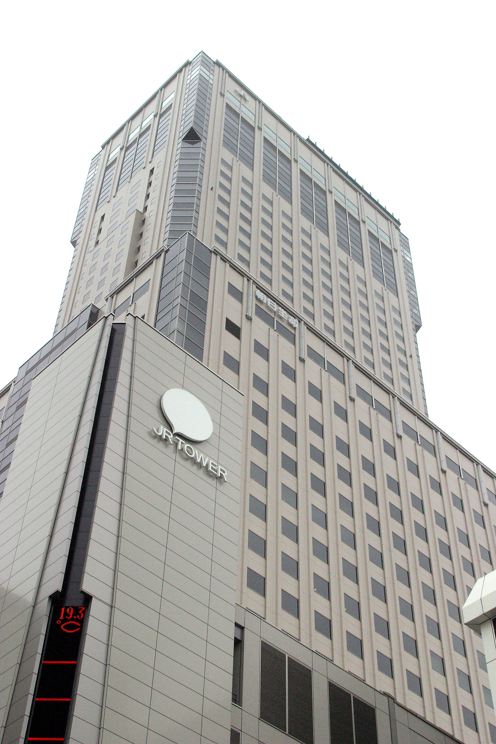
JR Tower Logo
- Client
- Sapporo Station General Development Co.,Ltd.
The JR Tower, a giant compound of facilities consisting of a shopping mall, offices and a hotel, was built as part of the re-development project of Sapporo station’s South gate. In designing the logo for the JR Tower, I thought of using the logo as a medium of communication and designed a balloon as a symbol mark, which could be filled freely with words or pictures. I also allowed the existing corporate color of yellow to be changed freely. In another words, I broke the common rule that forbids altering the logo. As a result, various applications have emerged making this flexibility the unique characteristic of the JR Tower.
2003

